|
/
More
|
|
/
More
|
Use the Workspace Designer section of your Sage 200 desktop to create your own workspaces or amend existing ones. Use the Workspace Designer to customise workspaces and content parts for all users.
Open: Tools > Workspace Designer. The workspace designer opens in a new window.
You can:
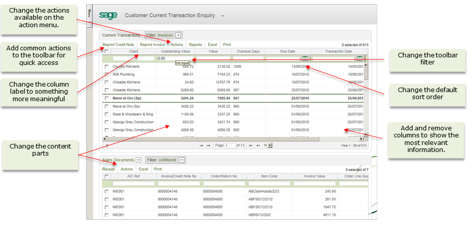
Each workspace consists of the following elements:
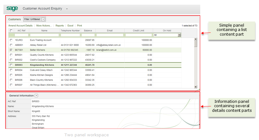
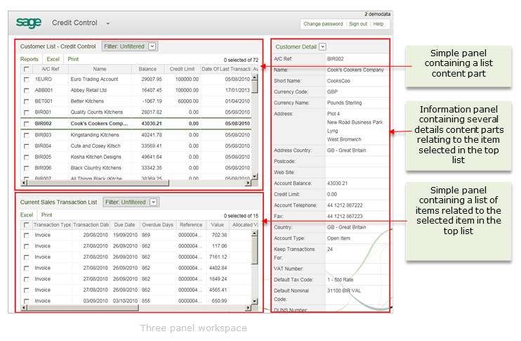
There are two types of panel.
Simple
These panels can only contain one content part. This is usually as a list.
A simple panel acts as a parent when linking panels together.
Information
These panels can contain more than one content part.
An information panel is used to display further information about a item selected from a list. Information panels must be linked to another Simple panel.
When adding information to your workspace, you choose from a pre-defined set of content parts.
There are three types of content part:
List
List content parts display records from Sage 200 such as a list of customers, a list stock items, a list of transactions, a list of orders and so forth.
Each database field is a column in the list.
Details
Details content parts display information in tables. Each database field is a row in the table.
Chart
Chart content parts display your information as a chart. Each database field is a bar on the chart.
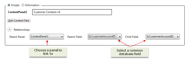
These are used when you want to link panels on your workspace.
You create links between panels by making parent and child relationships between the panels.
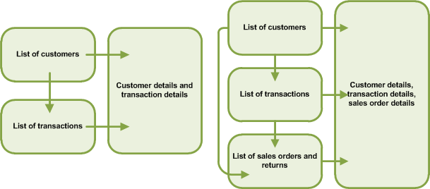
The parent panel contains the selected item.
A parent panel must always be a Simple panel containing a List content part.
The child panel contains information about the item selected in the parent panel.
Links are created on the child panel. You can only create these links when the content part on the child panel and the content part on the parent panel have at least one database field containing the same data.
.
Click New and select the required workspace layout. This is the number and arrangement of the panels.
Click OK to load the required workspace layout.
to each panel:
If you have chosen more than one panel for the workspace layout, choose the type of panel; Simple or Information.
At least one panel must be a Simple one. If the workspace has only one panel, this is Simple by default.
For Simple panels:
Enter all or part of the name of the content part, and select it from the drop-down list.
If you have created content parts, these appear in the drop-down list.
If this is the parent panel, you must choose a List content part.
 icon.
icon.Enter all or part of the name of the content part and select it from the drop-down list.
If you have created content parts, these appear in the drop-down list.
If you are adding several content parts and you want to display them in a drop-down list, select Display as dropdown.
between the panels:
Click Save and enter a Name ,Caption and Category for your workspace.
The caption is used as the title of the workspace in the application.
The category is used to decide where the workspace is displayed in the drop-down list.
The Name, Caption and Category can only contain letters or numbers and cannot have more than a single space between characters.
Add the required content parts.
If you change the layout to one that contains less panels, the last panels are removed. For example if you change a three panel workspace to two panel workspace, contentpanel3 is removed.
You can sort by name or caption to find the part you want.
You can only remove content parts that you have created.
to add a content part. to remove a content part
 to change the position of the content part.
 You can create new content parts or edit the contents of existing content parts, using the Content Part Designer.
For more information on the Content Part Designer, see Use the Content Part Designer..
You can only delete workspaces that you have
Some workspaces cannot be edited as they have special content or layout.
| Financials and Commercials Modules | Manufacturing
Modules |
|---|---|
| Bank SO/ DD Enquiry | Estimate Dashboard |
| Bill of Materials Dashboard | MSM Dashboard |
| Purchase Document Enquiry | MPS and Recommendations Dashboard |
| Archived Purchase Document Enquiry | MPS Schedule Dashboard |
| Purchase Document Line Enquiry | MPS Dashboard |
| Archived Purchase Document Line Enquiry | Planned WO Operations |
| Sales Document Enquiry | Planning Dashboard |
| Archived Sales Document Enquiry | WO Dashboard |
| Sales Document Line Enquiry | Estimate Profitability |
| Archived Sales Document Line Enquiry | MRP Recommendation By Action |
| Sales Invoice and Credit Enquiry | MRP Recommendation By Status |
| Sales Invoice and Credit Line Enquiry | MRP Recommendation By Type |
| Stock Trading History |
However, you can still make changes to the content parts used in these workspaces in the following way.
Enter the name of the content part required.
For example, to make a change to the Bank SO/DD Enquiry workspace, enter SO to search the list for standing orders and direct debit.
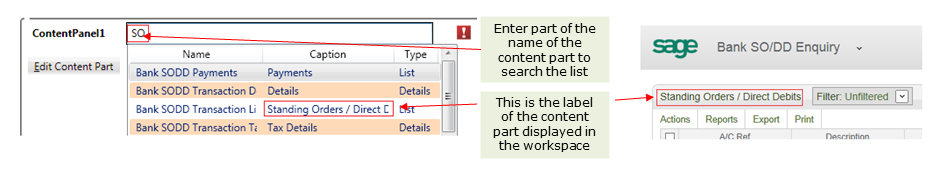
To save the content part, choose Edit Content Part > Save.
You do not need to save the new single panel workspace you created in order to edit this content part. The content part has been changed and this change will apply when you next view the workspace, for example, the SOs and DDs enquiry in the Cash Book.
Some changes can only be made to List type content parts.
Depending on the content part type you select, different selections are available to you in the Content Part Designer.
Each datasource is a query from the source of information you want to use. Each query contains a list of fields.
When you select the datasource further selections are displayed within the content part designer.
If you are using an On Premise deployment of Sage 200 and you know how to set up LINQLanguage Integrated Query. Used to extract information from a database, which can then be used in workspaces. database queries, you can create your own datasources from any of the Sage 200 modules and from third party applications. If you are not familiar with LINQ, you should contact your Business Partner for assistance.
For more information on the selections available, see What can you do in the Content Part Designer.
You can sort using the name or caption to find the part you want.
Depending on the content part type you select, different selections are available to you in the Content Part Designer.
For more information on the selections available, see What can you do in the Content Part Designer.
You can only delete a content part that you have edited and that is not being used on a workspace. You cannot delete a default content part.
Depending on the content part type you have selected, you can make selections as follows
| New datasource fields are visible by default |
If you are using an On Premise deployment of Sage 200 and you have set up your own database queries, you can select the New datasource fields are visible by default check box. This will allow you to see new fields in the datasource that have not been added to the content part. |
|||||||||||||||||||||||||||||||||||||||||||||||||||||||||||||||||||||||||||||||||||||||||||
| Is advanced filter enabled |
Select Is advance filter enabled to use the filter box at the top of a content panel on the workspace. On the workspace, you enter the required condition for the filter in the box. |
|||||||||||||||||||||||||||||||||||||||||||||||||||||||||||||||||||||||||||||||||||||||||||
| Is toolbar filter enabled |
Select Is toolbar filter enabled to use the filter on the toolbar in the workspace. |
|||||||||||||||||||||||||||||||||||||||||||||||||||||||||||||||||||||||||||||||||||||||||||
| List Definition |
Use this to choose the items of data that are displayed on a content part. Each column in the list displays data from a field in a table. In addition to adding and removing columns you can change the type of filter used in the quick filter bar for each column, change the label used for the column, or change the format of the data.
|
|||||||||||||||||||||||||||||||||||||||||||||||||||||||||||||||||||||||||||||||||||||||||||
|
Actions |
Use the Actions tab to choose actions that can be used on the content part within a workspace. All available actions are listed. Although you can't see from the list, there are two types of Action you can choose: A form action which opens a Sage 200 window and a Self Service action which opens another workspace. A user must have the relevant feature enabled for their role to be able to open a screen. This works in the same way as accessing an option from the menu. Select
To make an action available in the content part, select the Select check box for the action. To add all the actions, select the Select check box in the Select column header. To remove an action, clear the check box for the action. Once removed the action will not be available to any users and cannot be added to a workspace, using the Action Selector. Default
To make an action the default for the content part, select the Default check box for the action. |
|||||||||||||||||||||||||||||||||||||||||||||||||||||||||||||||||||||||||||||||||||||||||||
| Reports |
Use the Reports tab to choose reports that can be run from the content part on the workspace. The reports are filtered to display all available reports for this content part. Select
To make a report available to run in the content part, select the Select check box for the Target. To remove a report, clear the check box for the report. Once removed the report will not be available to any users. |
| New datasource fields are visible by default |
If you are using an On Premise deployment of Sage 200 and you have set up your own database queries, you can select the New datasource fields are visible by default check box. This will allow you to see new fields in the datasource that have not been added to the content part. |
|||||||||||||||||||||||||||||||||||||||||||||||||||||||||||||||||||||||||||||||||||||||
| List Definition |
Use this to choose the items of data that are displayed on a content part. Each column in the list displays data from a field in a table. In addition to adding and removing columns you can change the format of the data.
|
| Chart type |
Select the type of chart you want for the content part. Types of chart available are pie, line, area, column, bar, spline, stacked column, stacked bar and scatter. Depending on the chart type you select, different options are available for you to select. |
||||||||||||||||||
| Label Field |
Select the data field to use for the chart's X-Axis. |
||||||||||||||||||
|
Max Records |
Choose the maximum number of records you want to display on your x-axis. If you want to display all the data available, leave this blank. | ||||||||||||||||||
|
Sort Field |
Select the data field you want to sort the data on the chart area. You can sort the data using visible data fields (those in the Series DefinitionChart and Filter list) , or by using data fields that are not displayed (those in the Series DefinitionFilter Only list).. |
||||||||||||||||||
|
Descending |
By default, this data is sorted as ascending. To sort the data as descending, select Descending. |
||||||||||||||||||
|
Axes |
|
||||||||||||||||||
|
Additional Options |
|
||||||||||||||||||
| Series Definition |
All available data fields in the datasource are displayed in this section. Specify the data fields you want to use for the chart values from the Chart and Filter section. You can filter data using data fields from the Filter Only section but you cannot plot this data on the chart.
|
Steps in this task
Guidelines for designing custom workspaces
Reference
Creating new datasources - on premise only
Guides
 , maximise
  and close
  the Content Part Designer.